
.
This posting's title is what I'd like to call "Enron's ill-fated attempt to draw a middle ground between Good Rubbish and 1990's gangster rap group Westside Connection." I hope you enjoyed it. Now let us never speak of this again.
Things have been complicated in the world of Rubbish as of late, as I have not only been frantically trying to downgrade my new-ish computer (it's a refurbished replacement machine Dell sent to me because they were too lazy to fix my old computer) from Windows Vista to XP, but I've also switched cell phone carriers and have had to trudge through all of the expected crap that goes along with such a venture. Have I learned anything from all this? Why yes, yes I have... two things in fact:
1. Don't bother trying to downgrade an Inspiron 1520 from Vista to XP, unless you REALLY know what you're doing. You will fail several times, then you'll feel like an ass, then you'll give up.
2. Do not, under any circumstances, buy this phone. I only had that thing for about 20 hours before returning it, but you have my word that Nokia's 6555 is the single most counterintuitive piece of technology that I've ever encountered (please note that I'm making this statement despite the fact that I've been forced into using Windows Vista for the past few days). Beyond that, it was loaded up with about 20MB worth of entirely worthless game demos (see: Play them for 35 seconds, then get asked to pay 10 dollars for the full version) that are impossible to erase from the phone. Awful.
Anyway, those are my excuses for not posting anything substantive last week, but seeing as how I have no remaining excuses in place for this week, I suppose I should get an actual project up here, eh?
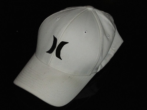
First things first: This image has been photoshopped. Why, you ask? Because the marvelous operating system that is Windows Vista arbitrarily corrupted the "this is what this thing looked like before I started fucking around with it" image I was going to use for this post, so I had to photoshop one of my later photos to make it function as though it were the first photo. Did that make any sense? Of course not, but let's not let that stop us from moving on to the next paragraph.
So that doctored photo above is a picture of my hat. I like that hat. It's white, so it doesn't clash with anything, and it's just the right size for my deceptively enormous head. It's made by Hurley, which is a clothing brand I have no problem supporting as they're about the only company left in America that makes polo style shirts with 3 buttons on the collar instead of 2 (the three button collar is of vital importance to lanky men like myself, as it helps us disguise the appearance of our spindly necks and massive, protruding collar bones). In all honesty, it could be one of the best hats I've ever owned... the only real problem with it is that about 8.5 million enormous douchebags (ranging from your typical northeastern guidobag to your less notorious but equally repugnant mountain climbing denverbag) also own that hat, and wear it with frequency. Because of this fact, I had grown terribly reluctant to wear this hat of mine, so I decided to try my hand at modifying it by turning the "H" logo into an "E," thereby making the whole piece of headwear a little more "me" and a whole hell of a lot less "them." Makes sense, right? Right.
So I had two options in doing this project, I could either cut away portions of the right side of the Hurley logo to make an E, like this:

Or I could do the same thing, but connect those remaining portions of the right side of the H to make a more traditional E, like this:

Personally, I thought the disjointed E looked a lot better than the traditional one, plus it required about 40% less sewing, so I called it a win/win situation and decided to go with that route.
The hat deconstruction process was quick and easy, as in the past few years I've grown extremely adept at undoing embroidery by removing the breast pockets on my collared shirts (breast pockets are another thing lanky people such as myself look terrible in, as our lack of meat in the shoulder region tends to leave those pockets floating an inch or two above our waists, instead of on the pectoral region where they're supposed to be). I initially tried to undo the embroidery in a way that would leave the parts I needed for my end product in place, but I failed miserably at this attempt, so I was left with this:

I'm sure there's a joke about sickle cell anemia that could be made here, but I REALLY don't want to be the one to make it. I guess this must be part of this obnoxious "process of growing up" that I keep hearing so much about. Lame.
Anyway, it was easy to tell where the outlines of the removed embroidery were on the hat, so I just used those lines as a guide and sewed horizontally over the middle, top, and bottom portions of my E, until those areas were pretty much covered entirely with a single layer of thread (I had a picture of this in between phase, but my lovely operating system saw fit to corrupt that file, too).
After that, I sewed back over those same spots, but this time I ran the thread vertically. This method brought with it an unintended consequence of stylizing the text a lot more than I was planning, but it came out looking not horrific, so I'm not at all displeased with the end product (in all honesty, this was the first time I'd ever tried to sew something that wasn't a button or the cuff of a pair of pants). Dig:
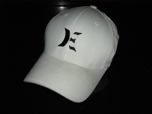
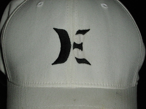
And a bit closer view:
Yeah, so on the whole I feel pretty good about this venture. The hat is once again wearable in my mind, though I am a bit concerned that the text came out looking kind of old english-ey... like something you'd see plastered to poorly tinted windows on the back of a lowered Ford F-150, next to a massive silhouette of the virgin mary.
Oh well, life goes on, as they say. Obla dee obla da. Here's lookin' at you, Corky!
Monday, August 4, 2008
MY NEEDLE AND THREAD'S LIKE A BLOW TO TO THE HEAD - BOW DOWN.
![]()
Subscribe to:
Post Comments (Atom)


No comments:
Post a Comment